If there’s one color that never seems to go out of style in the dining room, it’s green. Every time I walk into a green dining space, I can’t help but feel instantly grounded—it’s calming, welcoming, and just bold enough to make the room feel special. If you love a dramatic, moody vibe for cozy dinner parties or prefer something light and fresh that brightens up everyday meals, there’s a shade of green that works beautifully.
What I love most about green is how versatile it is. It pairs effortlessly with natural wood, looks elegant against crisp whites, and can even hold its own alongside bold accent colors. From heritage-inspired, muted tones to rich jewel greens, it has a way of adapting to both traditional dining rooms and more modern, minimalist spaces.
And if you’re still exploring paint colors beyond green, I also put together a post on the 16 best blue dining room paint colors—another timeless option that creates a completely different mood. But today, let’s focus on the fresh, nature-inspired beauty of green and why it’s one of the most timeless choices you can make for your dining room.
Why Choose Green for a Dining Room?
Whenever I think about the perfect dining room color, green always lands at the top of my list. There’s just something about it that makes a dining space feel warm and inviting without trying too hard. Maybe it’s because green is so closely tied to nature—it has this calming, restorative quality that makes people want to linger a little longer at the table. And honestly, isn’t that what we want from our dining rooms? A place to slow down, enjoy good food, and connect with the people we love.
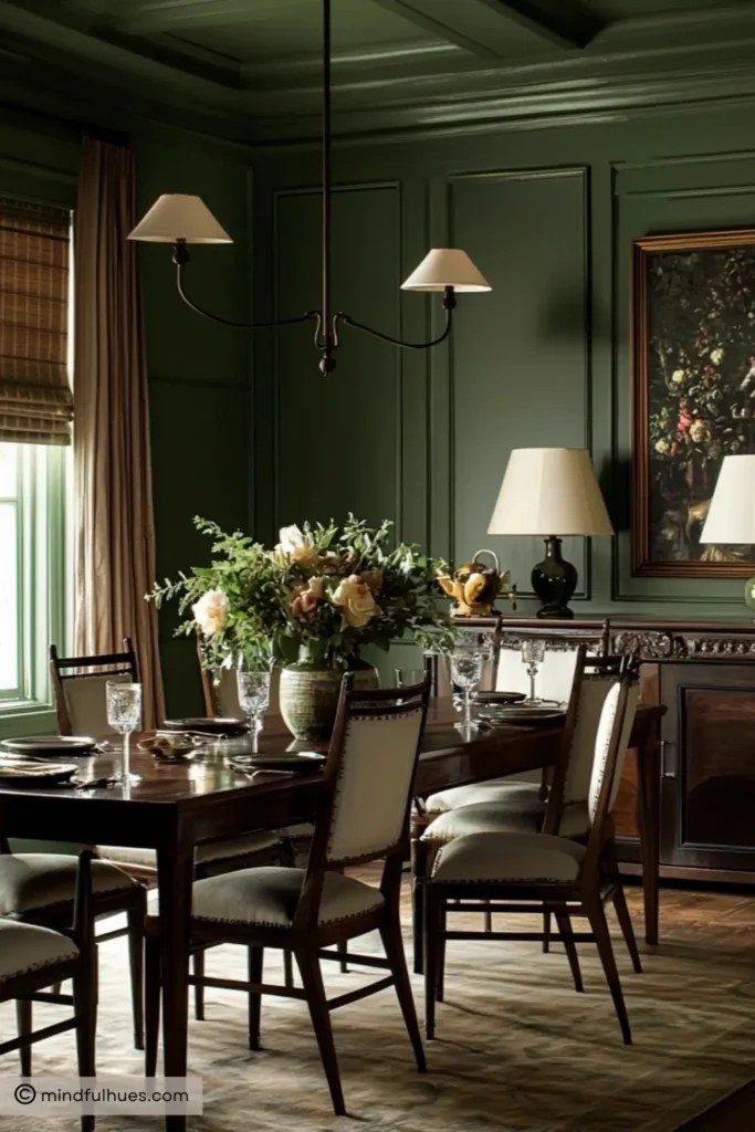
Another thing I love about green is its versatility. Lighter greens can feel cheerful and airy, making a small dining room look bigger and brighter. Darker, moodier greens bring instant drama and intimacy—perfect if you want your dining room to feel like a cozy little hideaway for dinner parties. Plus, green plays so well with other colors. Pair it with natural wood for an organic, earthy feel, or with metallics like brass and gold if you’re going for a more glamorous look.
In short, green is one of those rare colors that feels both classic and modern, no matter how you use it.
How to Choose the Right Green Paint for Your Dining Room
Here’s the tricky (and fun!) part about green: no two shades look the same once they’re up on your walls. A color that feels soft and sage in the paint store can suddenly look way darker—or even more yellow or blue—once you bring it into your home. That’s why choosing the right green comes down to a few key things.

Image Credit: basicprojects 📷 nicolefranzen
1. Pay attention to lighting
Natural light will pull out the brightness in greens, while artificial lighting can make them feel warmer or cooler. If your dining room gets a ton of sunlight, you might love a deeper green that holds its richness during the day. On the other hand, if your room is on the darker side, a lighter green can help keep it from feeling too heavy.
2. Notice the undertones
Some greens lean yellow (which makes them feel warm and cozy), while others lean blue or gray (which reads more calming and sophisticated). I always recommend grabbing a few samples, painting them on different walls, and watching how the color shifts throughout the day.
3. Think about your dining room style
Love a traditional look? Muted or historic greens like sage or olive are your best bet. Going for modern drama? Deep, moody greens will give you that bold statement. Want something fresh and family-friendly? A cheerful, mid-toned green is perfect.
4. Don’t forget about pairings
Green looks incredible with so many finishes—white trim, warm wood tones, black accents, even metallics. Before committing, think about your dining table, chairs, lighting, and flooring so your green feels cohesive with the rest of the space.
At the end of the day, the “right” green is the one that feels good to you. (And yes, a few paint swatches and some patience are worth it—you’ll be so much happier once you land on the perfect shade.)

15 Gorgeous Green Paint Colors for Dining Rooms
Now that we’ve talked about why green works so beautifully in a dining room (and how to choose the right one for your space), let’s get to the fun part—the colors themselves! I’ve pulled together 15 of my favorite green dining room paint shades from some of the most trusted brands out there.
What I love about this lineup is the variety. You’ll find everything from soft, subtle greens that feel light and fresh, to rich, dramatic tones that bring instant mood and sophistication. Whether your style leans farmhouse cozy, classic and timeless, or bold and modern, there’s a green here that can completely transform your dining room.
For each color, I’ll give you a quick feel for what makes it special and then share some practical tips on how to use it in your own home—because picking paint isn’t just about finding a pretty shade, it’s about making it work in your space.
So grab your design notebook (or maybe a glass of wine—this is dining room talk, after all), and let’s dive into the greens that can take your dining room from nice to absolutely stunning.
1. Arrow Head – Behr
If you’re looking for a green that feels fresh without being overpowering, Arrow Head by Behr is a beautiful choice. It’s a soft, sage-like green with just the right amount of gray undertone, which gives it a calm, refined character. The kind of color that feels welcoming for casual family dinners but still polished enough for hosting guests.

Image Credit: restorationhouseblog
How to use it: Arrow Head works especially well if you want a versatile backdrop that plays nicely with different dining styles. Pair it with crisp white trim for a clean, airy feel, or lean into warm wood tones for something cozier. I’ve even seen it paired with black dining chairs, and the contrast is gorgeous. If your dining room gets a lot of natural light, this shade really comes to life.
2. Yeabridge Green – Farrow & Ball
Yeabridge Green is one of those colors that just makes you smile. It’s a lively, mid-tone green with cheerful yellow undertones, and it has this energizing quality that instantly brightens a space. Think “fresh spring garden” but in paint form. If you want your dining room to feel vibrant and full of personality, this is the green for you.

Image Credit: mauraomalley 📷 davidpattersonphotography
How to use it: Because it’s such a bold, happy shade, Yeabridge Green shines in dining rooms with plenty of natural light. Pair it with rustic wooden furniture for a farmhouse vibe, or with black iron accents to give it a bit of modern edge. If you’re worried about it being “too much,” balance it with neutral curtains or a simple rug—it’ll still pop, but in a grounded way.
3. Rainy Afternoon – Benjamin Moore
Rainy Afternoon is the exact opposite of its name—in a good way. Instead of feeling gloomy, this muted, blue-green shade has a soothing, sophisticated vibe. It’s one of those colors that feels instantly calming – making it a perfect choice if you want your dining room to double as a cozy, intimate gathering space.

Image credit: Lizmearns 📷 stacyzaringoldberg
How to use it: I love this color in more formal dining rooms—it pairs beautifully with soft grays, creamy whites, or even brass light fixtures for a polished look. It’s also gorgeous if your dining table is a darker wood like walnut or mahogany. Add in a few textured linens and maybe some candlelight, and you’ve got yourself a dining room that feels like a little escape.
4. Studio Green – Farrow & Ball
If drama is what you’re after, Studio Green is the showstopper. At first glance, it almost looks black, but in the right light, you’ll notice its deep green richness come through. It’s moody, elegant, and instantly elevates a dining room into something that feels sophisticated and intimate.

Image Credit: ourvictorianmoneypit
How to use it: Because it’s so dark and bold, Studio Green works best in dining rooms where you want to create that cozy, dinner-party vibe. Pair it with warm brass fixtures, a statement chandelier, or even velvet dining chairs to lean into the luxe look. Don’t be afraid of the dark—it actually makes your space feel more inviting, especially in the evenings.
5. Georgian Green (HC-115) – Benjamin Moore
Georgian Green is one of those timeless shades that never feels out of place. It’s a soft, historic green with a gentle charm, making it perfect for a dining room that feels both classic and fresh. It has just the right amount of warmth to be welcoming without being too bright.

Image Credit: Bellacasainteriors 📷 kellyhorkoff
How to use it: This shade shines in traditional dining rooms, especially if you’ve got architectural details like crown molding or wainscoting. Pair it with creamy whites, beiges, or warm wood furniture to keep the space light and harmonious. If you want to add a touch of elegance, bring in antique brass or crystal lighting—it really complements the old-world charm of this color.
6. Green Smoke – Farrow & Ball
Green Smoke has such a cozy, nostalgic feel to it. It’s a smoky, gray-green that looks like it’s been pulled straight out of a historic home—but it still feels totally relevant today. There’s a depth to it that makes it feel calming and grounded, without being too heavy.

Image Credit: jaredhughesdesign 📷 etherartists
How to use it: This is the color I’d choose for a dining room where you want a mix of comfort and character. It pairs beautifully with antique or vintage furniture, natural linens, and warm metallics like brass. If your dining room leans more toward traditional or rustic, Green Smoke will feel like it’s always belonged there. Bonus: it looks stunning under candlelight.
7. Breakfast Room Green – Farrow & Ball
Breakfast Room Green is exactly what it sounds like—cheerful, lively, and full of light. It has a fresh, citrusy brightness that makes a dining room feel instantly more energetic. If your space needs a little pick-me-up, this green can do the job without feeling overwhelming.

Image Credit: rochellebloomdesign
How to use it: This shade is perfect if your dining room is the heart of your home, where family and friends gather often. It pairs beautifully with white trim and patterned textiles—think gingham or florals—for a happy, welcoming vibe. If you want to modernize it, bring in sleek black accents or bold artwork to balance out the playful energy.
8. Colonial Verdigris – Benjamin Moore
Colonial Verdigris is a rich teal-leaning green that feels both heritage and sophisticated. It’s one of those colors that makes you stop and stare because it has so much depth. A little moodier than your typical green, it adds instant drama while staying elegant.
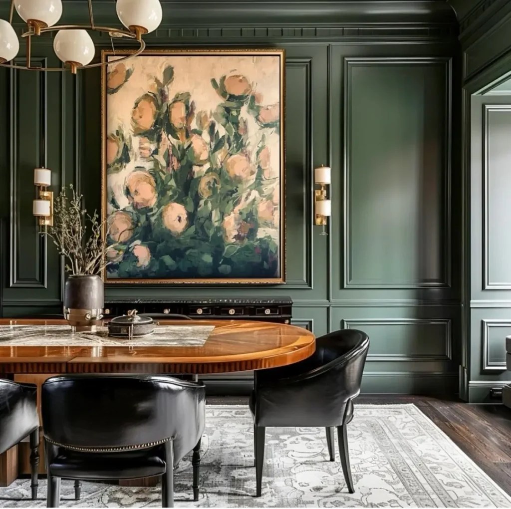
Image Credit: laurie_buck
How to use it: This color is made for traditional or eclectic dining rooms. Pair it with walnut tables, velvet chairs, or brass hardware for a luxurious feel. It’s especially stunning in evening light, where the teal undertones really shine. If your dining room doubles as a space for entertaining, this shade sets the perfect tone for memorable dinners.
9. Garden Party – Magnolia
If you love the idea of green but want something soft and playful, Garden Party by Magnolia is a beautiful option. It’s a gentle pastel green that feels light, airy, and fresh—like a spring morning in a can. It brings just enough color to make the dining room feel alive, without swallowing the space.

Image Credit: shannonsantiagohome
How to use it: Garden Party is great for farmhouse-style or casual dining rooms. It pairs well with whitewashed wood, wicker, or simple neutral textiles to keep things relaxed. If you want to layer in personality, try mixing in patterned seat cushions or a natural fiber rug. It’s the kind of green that feels easy and approachable, which makes it super versatile.
10. Ball Green – Farrow & Ball
Ball Green is one of those subtle, timeless greens that never shouts for attention but quietly makes a space feel serene. It’s a muted, slightly gray-green that gives off an understated elegance—perfect if you want your dining room to feel calming and classic.

Image Credit: Danielle Rollins
How to use it: Ball Green looks incredible in dining rooms with lots of natural textures. Pair it with warm oak, aged pine, or even stone accents to create a grounded, cozy feel. If your style leans traditional or rustic, this shade will feel right at home. To keep it from feeling too muted, layer in warm lighting—think candles or a soft-glow chandelier.
11. Avocado – Benjamin Moore
Avocado is bold, unapologetic, and just a little retro—in the nicest way. With strong yellow undertones, it’s a green that brings instant personality to a dining room. If you’re someone who loves color and isn’t afraid of a little drama, Avocado will deliver.
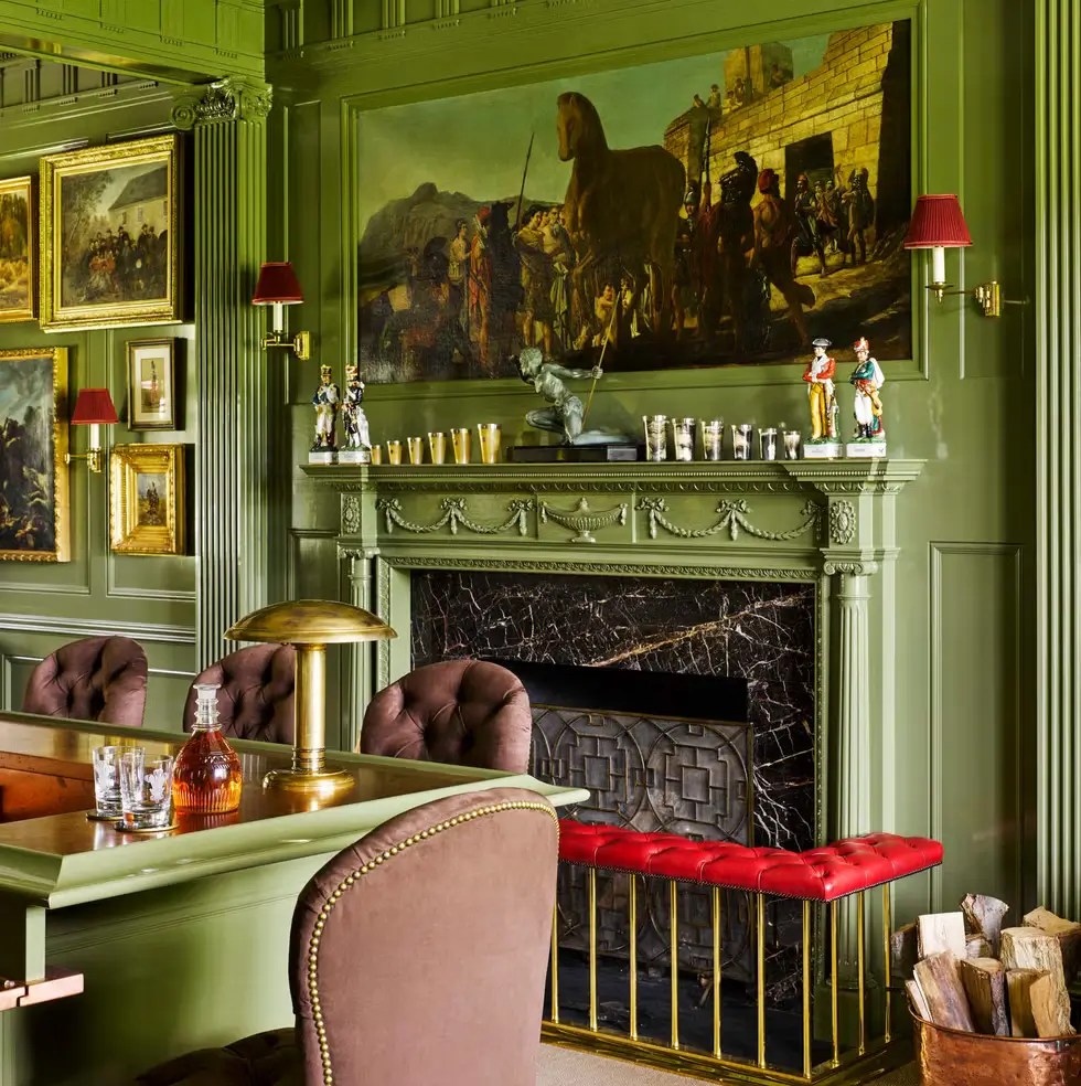
Image Credit: McMillen Inc.
How to use it: This shade is practically made for mid-century modern dining rooms. Pair it with teak or walnut furniture, clean lines, and a few brass accents to really lean into that retro-chic vibe. It also works as an accent wall if you’re not ready to commit to a full green room. Add a statement light fixture, and you’ve got a space that feels fun and unforgettable.
12. Bancha – Farrow & Ball
Bancha is deep, grounding, and elegant—it’s an olive-toned green that instantly makes a dining room feel more intimate. There’s something about it that feels both modern and timeless, which is why it works across so many design styles.

Image Credit: stylebyemilyhenderson
How to use it: If you want your dining room to feel like a cozy, dinner-party haven, Bancha is a perfect choice. Pair it with darker woods, leather dining chairs, or even a rustic farmhouse table for a warm, inviting look. To keep the space from feeling too heavy, balance it with lighter accents—cream drapes, linen upholstery, or a neutral rug.
13. Constable Green – Neptune
Constable Green is soft, elegant, and a little bit understated—the kind of shade that feels like it belongs in a centuries-old countryside home. With its blue undertones, it has a slightly cooler vibe than some of the warmer greens on this list, giving it a refined, almost heritage-like feel.
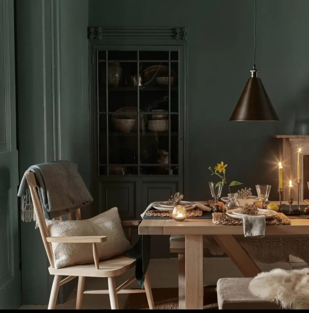
Image Credit: Neptune
How to use it: This shade is perfect if your dining room leans traditional, rustic, or cottage-inspired. It pairs beautifully with natural stone, light linens, and antique-style wooden furniture. If you want to keep things bright, add in cream or off-white accents; if you’d like to bring out the richness, layer in darker woods or aged brass.
14. Vintage Vogue – Benjamin Moore
Vintage Vogue is moody, dramatic, and endlessly sophisticated. It’s a dark green with gray undertones that make it lean toward charcoal—so if you want a bold statement without going all the way to black, this is a stunning option. It instantly transforms a dining room into a high-end, elegant space.

Image Credit: aol.com
How to use it: Use Vintage Vogue if you’re aiming for drama and intimacy. It works beautifully with metallics (brass, gold, or even polished nickel) and feels luxurious when paired with velvet or leather seating. For balance, keep your trim or ceiling a lighter neutral so the room doesn’t feel too closed in. Add a chandelier or layered lighting, and you’ll have a dining room that feels straight out of a design magazine.
15. Forestwood – Sherwin Williams
Forestwood is lush, deep, and grounded—like bringing the richness of the woods right into your dining room. It’s the kind of green that instantly connects you to nature, creating a space that feels earthy but still refined.

Image Credit: Ampersand Living Via: whiteoakandlinen
How to use it: This shade is a dream for nature-inspired dining rooms. Pair it with rattan, stone, or natural wood for an organic look, or contrast it with matte black accents for a modern twist. Because it’s so rich, it really shines with layered textures—think woven rugs, linen drapes, and warm lighting. If you love the idea of a cozy, immersive dining space, Forestwood is a winner.
Remember, choosing a dining room paint color is never just about the walls—it’s about setting the mood for every meal, from casual breakfasts to long, laughter-filled dinners with friends. What I’ve found over the years is that green has this rare ability to adapt to whatever you need your dining room to be. Some shades create intimacy, others bring in energy, and a few manage to strike that perfect balance of both.
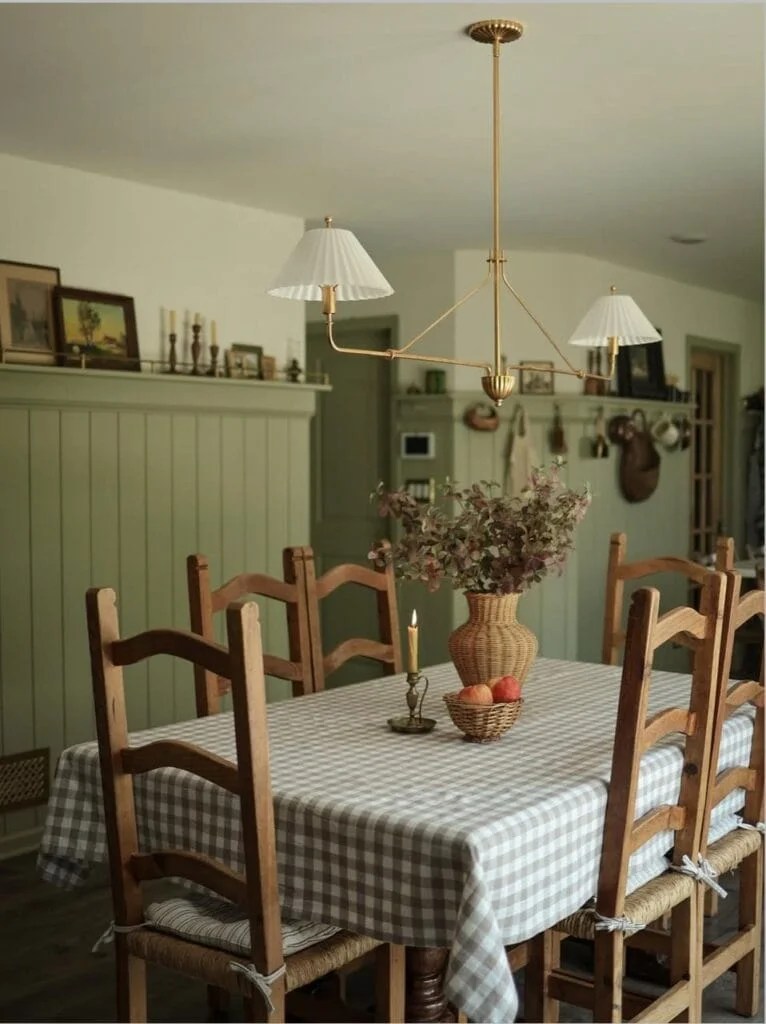
Image Credit: ashleylynhome
If you’re feeling torn between a couple of options, here’s my favorite trick: don’t just paint swatches on the wall—tape big pieces of poster board, paint them, and move them around your dining room throughout the day. It’s amazing how much the light will shift a color. You’ll start to see pretty quickly which shade makes you excited every time you walk past.
And remember, paint is one of the easiest (and most affordable) ways to completely transform a space. So don’t be afraid to take a little risk. The right green can turn an ordinary dining room into a place where memories are made, stories are shared, and meals feel just a little more special.
Hey there. This is killing me. What green is in the very top picture with the dark wood dining set that is unlabeled? I love it! Thanks,
That image is a design mock-up digitally color-corrected in Photoshop to match Vintage Vogue by Benjamin Moore. Hope this helps!