Have you ever noticed how stepping into a room painted green just feels… different? There’s something about this color that gently grounds you. Maybe it’s because green is the color of nature, growth, and balance—it’s the shade of forest walks, leafy houseplants, and even that calm feeling you get after a long day when you finally sit down with a cup of tea. In interior design, green paint has its own appeal: it can be soft and soothing, bold and dramatic, or fresh and energizing—all depending on the shade you choose.
That’s exactly why I’ve put together this two-part guide on the most gorgeous green paint colors for living rooms. With so many options out there, choosing the right green can feel overwhelming. So, in this series, I’ll break it down into 20 carefully chosen shades that designers (and homeowners like you) absolutely love.

In this post—Part 1—we’ll look at the first 10 shades. From airy olives and nature-inspired sages to deep, moody hunter greens, you’ll get not just a description of each paint but also real-life examples and tips for using them in your living room. If you’re going for a bright, welcoming space or even a dramatic, cocoon-like retreat, you’ll find a green here that sets the perfect tone.
And if you’re craving a calm, tranquil living room vibe but aren’t quite ready to go green, don’t worry—I’ve also rounded up some of the best blue living room paint colors in another post, which is worth checking out for inspiration.
Why Choose Green Paint for Your Living Room?
If you’re on the fence about painting your living room green, let me give you a little nudge: green is one of the most versatile, mood-shaping colors you can bring into your home. Unlike some trend-driven shades that can feel dated in a few years, green has stood the test of time in interior design. Here’s why it might be the color you didn’t know your living room needed:
- It’s nature in a can. Think about how refreshed you feel after a walk in the park or a hike through the woods. Painting your living room green brings that same sense of calm and balance indoors. It’s like giving your space a permanent connection to the outdoors.
- Green works with every style. Whether your living room leans modern and minimal, rustic and cozy, or sleek and traditional, there’s a green that fits. Soft sage tones act like neutrals, while deep forest greens can add drama and sophistication.
- It plays well with others. One of the best things about green is how easily it pairs with other colors and textures. Pair it with crisp whites for a fresh look, warm woods for a natural vibe, or even metallics like brass and gold for a luxe feel.
- It’s mood-shaping. Lighter greens can make your space feel more open and airy, while darker greens create intimacy and a sense of cocooning comfort. That means no matter what mood you want in your living room, there’s a shade of green to help you achieve it.
At the end of the day, choosing green is about creating a space that feels both stylish and restorative—a room you’ll actually want to spend time in, whether you’re entertaining guests or curling up on the couch with a book.

Who Should Consider Green?
Green isn’t just “one-size-fits-all.” Different shades speak to different personalities and lifestyles. If you’re wondering whether it’s the right move for your living room, here are a few clues that green might be your perfect match:
- Nature lovers (or city dwellers craving it). If you find yourself drawn to plants, natural light, and earthy textures, green is a no-brainer. And if you live in a busy city, green paint can be your way of bringing the outdoors in—your own little escape from the concrete jungle.
- Those who want calm without going boring. Beige and gray can feel safe, but sometimes they fall flat. Green offers the same neutrality with more personality. It’s calming like a neutral paint color but still adds richness and depth.
- People who like versatile backdrops. Do you love swapping out throw pillows, rugs, or artwork with the seasons? Green is the kind of color that adapts beautifully—it can look fresh in summer and cozy in winter without you having to repaint.
- Fans of timeless style. Some shades come and go (remember millennial pink?), but green has staying power. From historic homes to modern apartments, it’s always had a place in design. If you want something that won’t look “so last year” in two years, green is a solid choice.
In short, if you want a living room that feels welcoming, timeless, and grounded all at once, green is worth serious consideration.
10 Gorgeous Green Paint Colors for Living Rooms
1. Daily Greens – Clare Paint
If you’re looking for a green that feels fresh but not overwhelming, Daily Greens by Clare Paint is a fantastic starting point. It’s a modern, medium-toned green that has just enough vibrancy to lift a room without tipping into “too bold” territory. Think of it as the perfect everyday green (hence the name!)—cheerful, balanced, and easy to live with.

Design: ceciliacasagrande 📷 Jared Kuzia
Why it works in living rooms:
Daily Greens shines in spaces where you want energy but also comfort. It’s bright enough to keep a smaller living room from feeling cramped, but not so intense that it steals the show. It also holds its color beautifully in natural light, making it a great option if your living room gets a lot of sun.
Styling tips:
- Pair it with white trim and light oak floors for a clean, natural look.
- Add woven textures like rattan or jute to play up its organic vibe.
- If you want a modern twist, combine it with black accents (like sleek coffee tables or lighting fixtures) for a crisp, elevated finish.
2. Chelsea Green II – Paint & Paper Library
Now let’s step into something richer: Chelsea Green II by Paint & Paper Library. This shade leans into the deeper, more elegant side of the spectrum. It’s a sophisticated green with a slightly traditional feel, perfect if you’re going for a cozy yet refined living room.
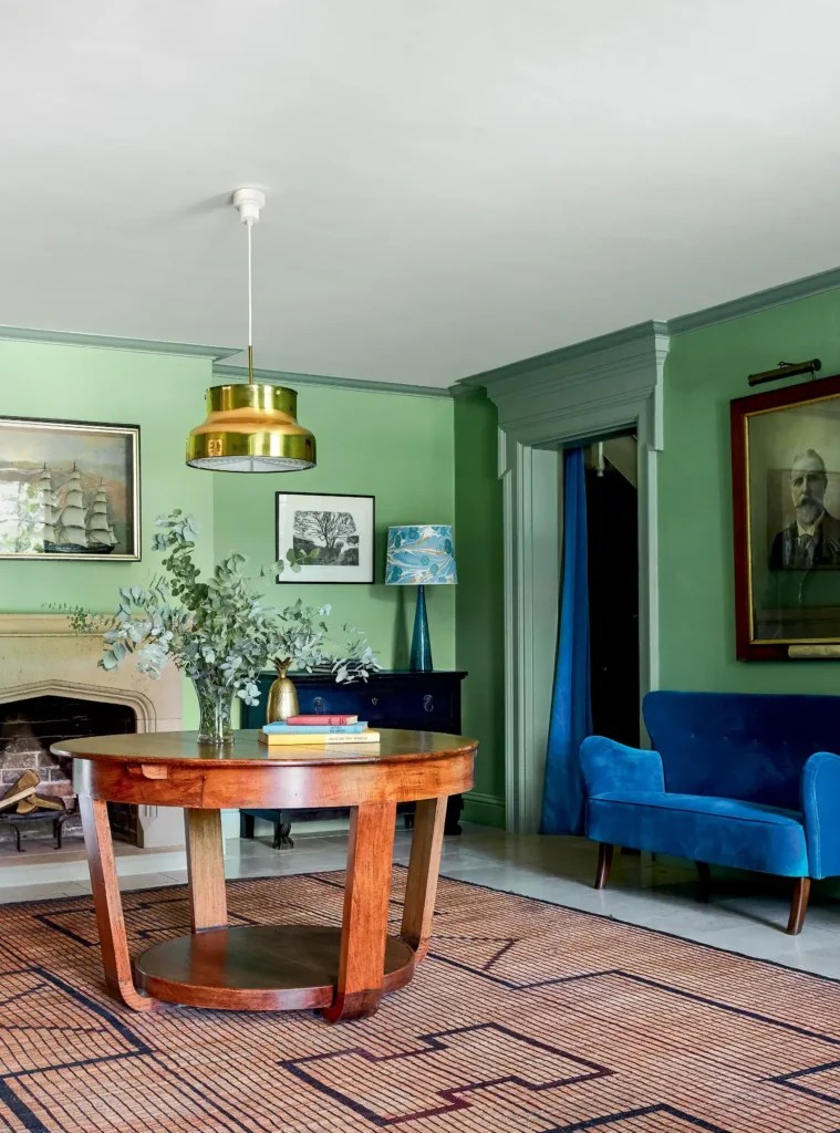
Image credit: houseandgardenuk 📷 @Paul_massey
Why it works in living rooms:
This isn’t a green that whispers—it makes a statement. Chelsea Green II wraps your space in warmth and depth, making it ideal for larger living rooms or open-plan areas where you want the walls to create a sense of intimacy.
Styling tips:
- Pair it with brass or gold accents (think coffee table legs, curtain rods, or light fixtures) for a touch of luxury.
- Works beautifully with velvet sofas or rich textiles like wool and tweed for a layered, high-end look.
- Balance the richness by adding lighter elements—soft cream rugs, off-white lampshades, or pale artwork—to keep the room from feeling too heavy.
3. Apple Smiles II – Paint & Paper Library
If your living room could use a little boost of cheer, Apple Smiles II by Paint & Paper Library might be the exact shade you’re after. It’s a lively, upbeat green that feels playful without being childish—like a fresh apple right off the tree. This color is perfect if you want your living room to feel inviting, bright, and full of personality.
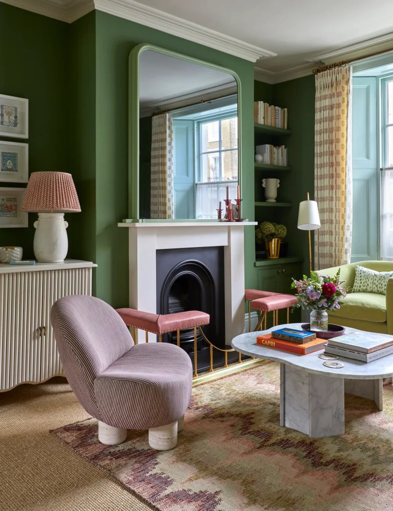
Image Credit: houseandgardenuk
Why it works in living rooms:
Apple Smiles II is a shade that instantly lifts the mood of a room. It’s especially great in family living spaces where energy and warmth matter most. The brightness makes it a good fit for smaller rooms or north-facing living rooms that don’t get tons of natural light—it adds a sunny vibe even when the sun isn’t streaming in.
Styling tips:
- Pair with natural fibers like linen or cotton for a relaxed, welcoming feel.
- Bold patterned cushions or rugs in complementary colors (like coral, mustard, or navy) can make this green sing.
- To tone it down, layer in warm neutrals (beige, tan, soft gray) so the color feels lively but not overwhelming.
4. Hunter Dunn – Paint & Paper Library
For those who lean toward drama and depth, Hunter Dunn by Paint & Paper Library is a showstopper. It’s a classic hunter green that feels timeless and bold, the kind of color that instantly adds gravitas to a living room. If Apple Smiles II is sunshine, Hunter Dunn is the evening forest.
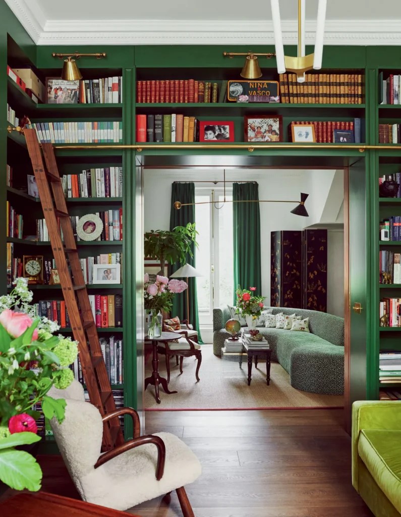
Image Credit: ninalitchfieldstudios 📷 Michael Sinclair
Why it works in living rooms:
Hunter Dunn creates a cozy, cocooning effect, making large rooms feel more intimate and smaller spaces feel like a stylish retreat. It’s a perfect choice for traditional interiors, heritage homes, or anyone who loves the look of a moody, layered living room.
Styling tips:
- Pair with dark wood furniture (walnut, mahogany) to emphasize its richness.
- Add texture through leather chairs, velvet cushions, or wool throws for a luxe, lived-in feel.
- Use warm metallics like antique brass or aged bronze in lamps and frames to keep the space glowing instead of feeling too heavy.
5. Invisible Green – Edward Bulmer Paint
Don’t let the name fool you—Invisible Green by Edward Bulmer may be subtle, but it makes a big impact in the right setting. This is a soft, muted green that almost behaves like a neutral. It doesn’t scream for attention; instead, it creates a gentle backdrop that lets the rest of your décor shine.

Design: jrdesignlondon 📷 @Paul_massey
Why it works in living rooms:
Invisible Green is ideal if you want a calm, understated space that still has character. Because it’s not too bold, it works beautifully in smaller living rooms or in homes where you want your furniture and art to take center stage. It’s also a great way to dip your toe into green if you’re a little color-shy.
Styling tips:
- Pair with off-whites, soft grays, or creams for a serene, layered look.
- Works wonderfully with natural textures—linen curtains, sisal rugs, or raw wood accents.
- To warm it up, add touches of terracotta or tan leather in accessories.
6. Basque Green – Sherwin Williams
For a green that feels grounded and earthy, Basque Green by Sherwin Williams is a standout. It’s a medium-toned shade with warmth in its undertones, giving it a more organic, slightly rustic vibe than some of the cooler greens.
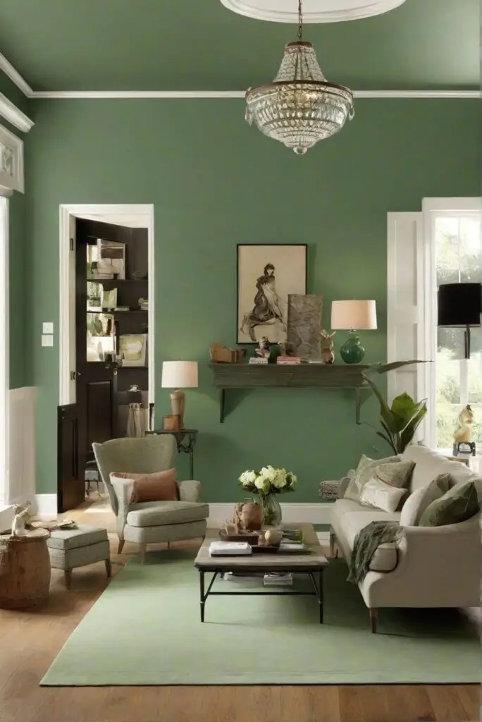
Image Credit: westpearinteriors
Why it works in living rooms:
Basque Green has a welcoming, lived-in quality—the kind of shade that makes a living room feel instantly cozy without being dark. It works beautifully in transitional or eclectic homes where you want a touch of color that feels natural and unpretentious.
Styling tips:
- Pair with terracotta accents (planters, tiles, or pottery) to play up its earthy side.
- Combine with woven textures like rattan or jute for a laid-back, organic vibe.
- Works beautifully with matte black hardware or lighting for a modern contrast.
7. Evergreen Fog – Sherwin Williams
If you’ve been following paint trends, you’ve probably heard of Evergreen Fog by Sherwin Williams—it was their 2022 Color of the Year, and for good reason. This shade is a soft gray-green that’s effortlessly elegant. It’s subtle enough to feel neutral but has just enough depth to make a room feel thoughtful and serene.
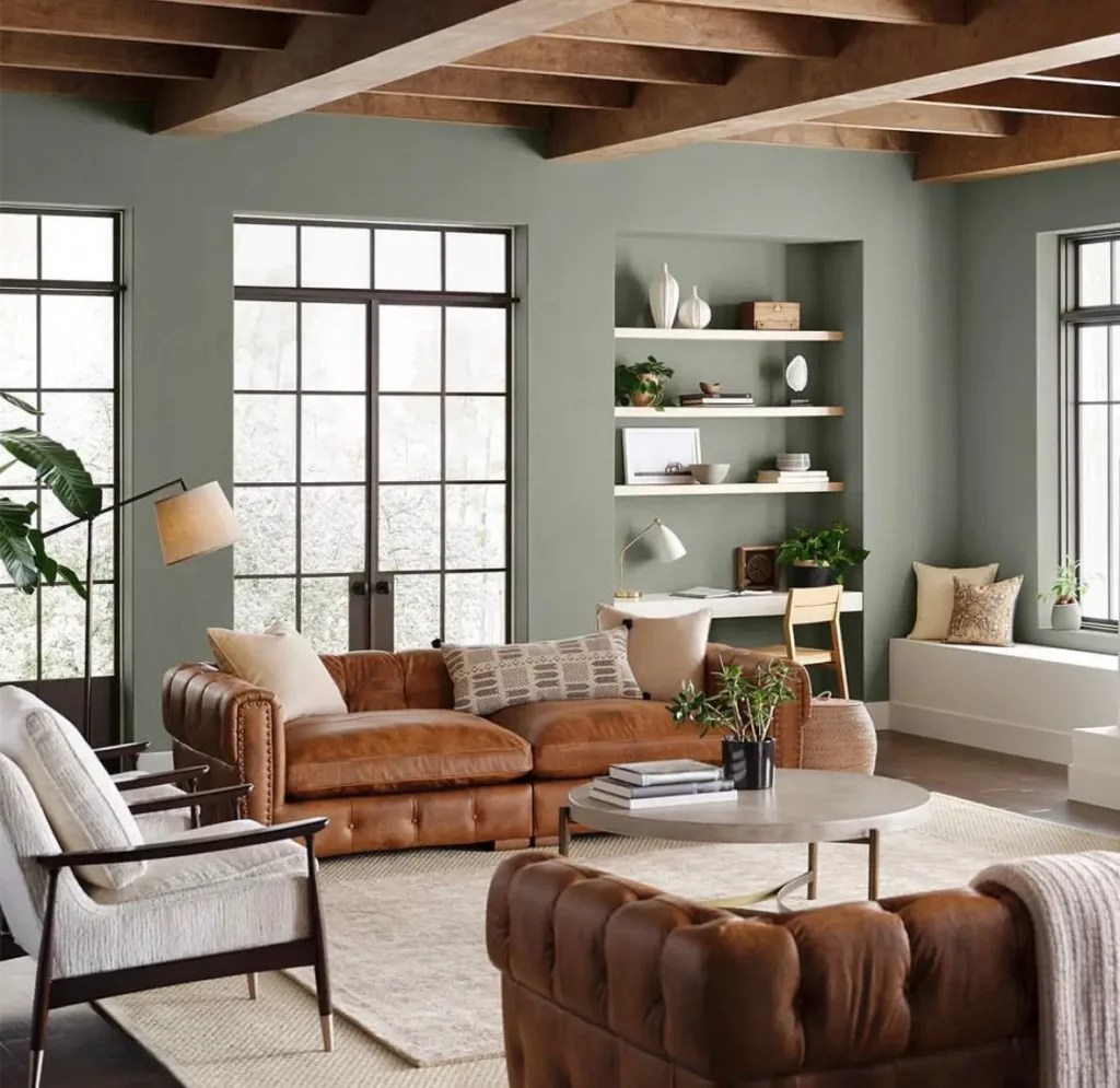
Image Credit: Sherwin Williams
Why it works in living rooms:
Evergreen Fog is like the shape shifter of greens. It changes slightly depending on the light—leaning more gray in dim spaces and showing its green side in bright daylight. That adaptability makes it perfect for open-plan living rooms or spaces where you want a calming backdrop that still has personality.
Styling tips:
- Pairs beautifully with soft beiges, taupes, and creams for a layered, organic palette.
- Bring in warm wood tones and natural fabrics (linen, cotton, wool) to enhance its softness.
- Add contrast with matte black fixtures or charcoal accents for a more modern, grounded look.
8. Rosepine – Benjamin Moore
On the other end of the spectrum, Rosepine by Benjamin Moore is a deep, moody green with subtle blue undertones. This shade is rich, dramatic, and oh-so-cozy—perfect if you love the idea of a living room that feels like a cocoon at the end of a long day.

Image: Benjamin Moore
Why it works in living rooms:
Rosepine creates intimacy, which makes it an excellent choice for living rooms where you want to relax, unwind, or entertain in style. It works especially well in rooms with good natural light, as the sunlight brings out its depth without making it feel too dark.
Styling tips:
- Pair with muted metallics like brushed gold or antique brass for a sophisticated glow.
- Layer in velvet or mohair fabrics for a luxurious, tactile feel.
- Balance the depth with soft lighting (lamps, sconces, candles) to keep the atmosphere warm and inviting.
10. Light Olive Green – Edward Bulmer Paint
If you love greens with a touch of vintage charm, Light Olive Green by Edward Bulmer is a shade to seriously consider. It has that warm, Mediterranean-inspired quality that instantly makes a space feel sun-kissed and inviting. This isn’t the bold, emerald kind of green—it’s understated, lived-in, and endlessly versatile.

Image Credit: @antony_d_o_duthie Via: edwardbulmerpaint
Why it works in living rooms:
Light Olive Green strikes a balance between neutral and colorful. It’s subtle enough to act as a backdrop but has just enough personality to keep your living room from feeling bland. Perfect if you want something warm and welcoming without overpowering your décor.
Styling tips:
- Pair with terracotta accessories (vases, planters, or tiles) for a Mediterranean vibe.
- Combine with cream or beige upholstery for a soft, elegant look.
- Add brass details—think lighting fixtures, coffee table accents, or curtain rods—to highlight its warmth.
Wrapping Up Part 1
That brings us to the end of Part 1 in this 2-part series on gorgeous green paint colors for living rooms. We’ve covered the first half of the lineup, but there’s still so much more to come. In Part 2, I’ll be sharing 10 additional greens that bring their own unique moods—everything from soft and grounding to bold and dramatic.
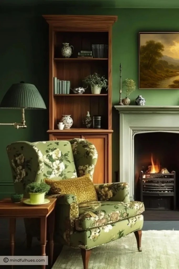
If your personal style leans more toward modern, Scandinavian, or coastal interiors, you might also love my post on white living room paint colors. Green is all about warmth and connection to nature, but crisp whites offer a clean, timeless base that works beautifully if you prefer a lighter, airier aesthetic.
And yes, for those of you wondering: “Where are the Farrow & Ball greens?”—they haven’t been forgotten. In fact, I’ll be dedicating a whole post to 15 Farrow & Ball Green Living Room Paint Colors soon. There are simply too many stunning shades in their palette to fit into this two-part series.
So stay tuned—Part 2 is on the way, and it just might feature the green that transforms your living room.
Leave a Reply