Your entryway is the very first glimpse guests get of your home—and honestly, it sets the tone for how you feel every time you walk in the door. Think about it: it’s the one spot you see coming and going, the little in-between space that greets you after a long day or sends you off in the morning. That’s why I always say the entryway deserves just as much attention (if not more!) as the living room or kitchen.
Over time, I’ve covered entryways from every angle—how to style them seasonally (remember my spring entryway décor post?), how to make them feel more harmonious with feng shui entryways, and even how a splash of cheerful color can uplift the mood (if you love vibrant tones, you’ll want to peek at my post on yellow entryways). Each approach brings something different to the space, depending on your style and the energy you want to invite into your home.
But lately, there’s been a big shift in design: homeowners are leaning into dark, moody paint colors that bring drama, sophistication, and a little unexpected shade to this often-overlooked space. These shades can create atmosphere, highlight your personality, and give guests that “wow” moment before they’ve even taken their shoes off.
In this post, I’m sharing 12 of my favorite dark and moody paint colors for entryways, along with practical tips on how to use each one so your foyer feels bold and beautiful without taking over the space.
Why Choose Dark Paint for Your Entryway?
Most of us have been taught to keep entryways light, bright, and neutral—basically the “safe” route. And sure, a soft white or pale gray can feel airy and open, but here’s the thing: entryways are usually small, transitional spaces. They’re not places you linger in for hours, which makes them the perfect spot to take a design risk.
That’s why dark paint works so beautifully here. A deep navy, smoky green, or moody charcoal instantly creates drama the moment you walk through the door. Instead of just being a pass-through, your entryway suddenly has presence and personality—it feels alive.
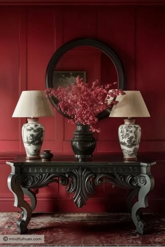
There’s also a practical side to going dark: these shades are excellent at disguising the scuffs, fingerprints, and general wear-and-tear that entryways tend to collect. If you’ve ever cringed at the marks left by bags, shoes, or kids brushing by the walls, you’ll love how forgiving a rich color can be.
And don’t worry—dark doesn’t mean gloomy. With the right lighting (think overhead pendants, wall sconces, or even a statement lamp on a console table) and a few contrasting accents, dark walls can feel warm, cozy, and incredibly stylish. They actually set the stage for everything else in your home, creating that “wow” factor guests notice right away.
In short: dark paint in the entryway is bold, practical, and surprisingly versatile. Whether your style leans modern, traditional, or somewhere in between, a moody color can make your home’s first impression unforgettable.
Who Should Consider Dark Entryways?
Dark, moody paint isn’t for everyone—and that’s okay. But if you’ve ever swooned over a dramatic foyer on Pinterest or paused mid-scroll when you saw a gorgeous inky wall paired with brass lighting, chances are you’ll love it in your own home.
You should definitely consider a dark entryway if:
- You want a bold first impression. Your entryway is the handshake of your home. If you’d like it to feel confident, dramatic, and stylish from the get-go, a moody color sets the stage.
- You’re not afraid of personality. Lighter shades are safe, but deep colors—navy, green, charcoal, even red—show off a bit more character. They make your home feel less cookie-cutter and more you.
- Your space gets good lighting. Natural light, a statement pendant, or layered lamps all help dark walls shine. Even if your foyer is smaller, the right lighting will make the space feel cozy instead of closed-in.
- You love the idea of a “jewel box” space. Think of your entryway as a little design laboratory. Because you don’t spend hours in it, you can go bolder here than you might in a living room or bedroom.
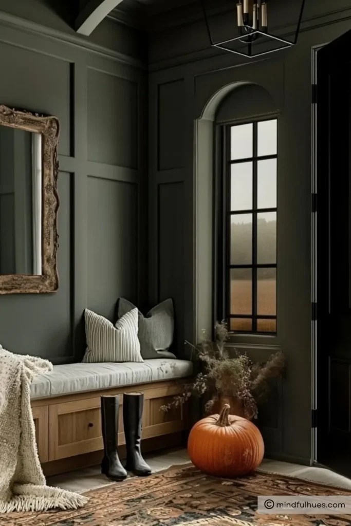
On the other hand, if you prefer open, airy, and ultra-minimalist vibes, you might feel more comfortable sticking with light neutrals. And that’s totally fine—remember my posts on feng shui entryways and yellow entryways? Both show how brighter palettes can also make your foyer sing.
But if you’re craving drama, depth, and that unforgettable first impression, a moody entryway might just be your perfect match.
12 Dark Entryway Paint Colors That Make a Bold First Impression
1. Midnight Blue – Behr
If you’ve been craving a classic navy that feels timeless but still packs a punch, Midnight Blue by Behr is one to try. It’s rich and velvety, sitting somewhere between a deep midnight sky and a tailored navy blazer. Unlike some dark blues that can lean too gray or too black, Midnight Blue keeps just enough saturation to feel alive and welcoming in an entryway.
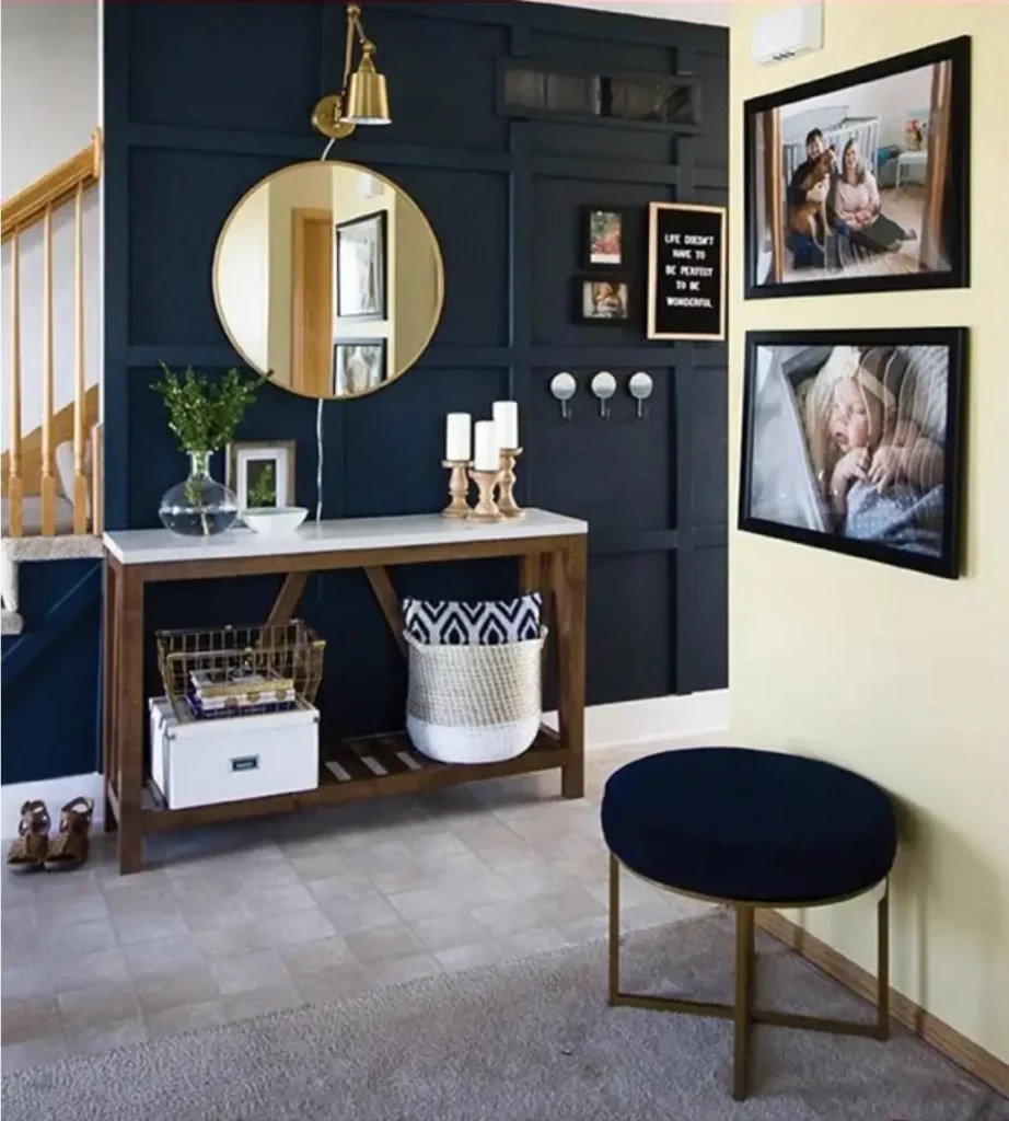
Image Credit: smallstuffcounts
Why it works in entryways: Navy is incredibly versatile—it’s bold but not overwhelming, moody but still approachable. In small foyers, this shade creates that “jewel box” effect, instantly making the space feel more intentional and styled. In larger entryways, it offers just enough depth to ground the space without stealing the spotlight from your furniture, rugs, or art.
Tips for using it:
- Pair with crisp white trim for contrast, or go tone-on-tone by painting the trim in the same color for a cocooning effect.
- Metallic finishes like brass or antique gold really pop against this shade, so think statement light fixtures, hardware, or even a gilded mirror.
- Balance the cool undertones with a warm, patterned runner or natural woven textures (like rattan baskets or a jute rug).
- If your entryway is tight on natural light, use a semi-gloss finish—it will bounce light around more than flat paint.
2. Deep Sea Green – Benjamin Moore
For those who love color but want something with real depth, Deep Sea Green by Benjamin Moore is like a breath of ocean air bottled into paint form. It’s a saturated teal-green that shifts beautifully throughout the day: more blue in natural light, more green in the evening. The result is a rich, jewel-like tone that feels both luxurious and calming.
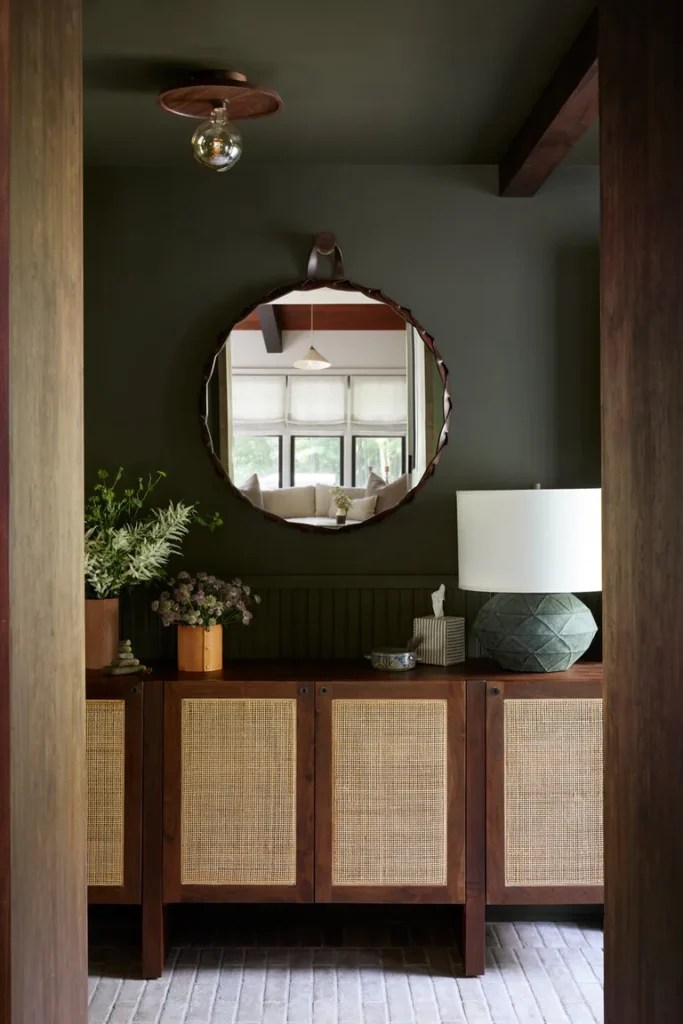
Image Credit: Becky Shea Design 📷 Sean Litchfield
Why it works in entryways: This shade is ideal if you want your foyer to feel like an experience. It’s not a color you see every day, which makes it memorable the moment guests walk in. It has that moody, dramatic vibe, but because it leans toward teal, it also carries a lively energy—perfect for welcoming people into your home.
Tips for using it:
- Works beautifully with warm woods (think walnut console tables or oak floors) that balance out the coolness of the color.
- Add woven textures—like a sisal rug or a rattan pendant light—to soften the richness and keep it from feeling too formal.
- If your entry opens into other rooms, Deep Sea Green transitions nicely into lighter shades of cream, soft gray, or even blush for contrast.
- For a bold look, pair it with black hardware and dramatic artwork; for something softer, add brass or bronze accents.
This color is all about mood—unexpected, a little daring, but absolutely stunning in the right space.
3. De Nîmes – Farrow & Ball
If you love a moody blue but want something a little softer than navy, De Nîmes by Farrow & Ball is a dream. Inspired by traditional French workwear fabric, it has a muted, slightly gray undertone that keeps it grounded and sophisticated. Think of it as the color of a perfectly worn pair of denim—easy, familiar, and versatile.
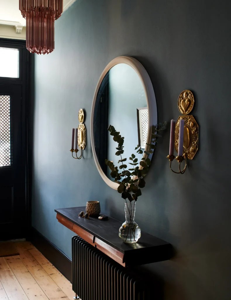
Image Credit: houseandgardenuk
Why it works in entryways: Unlike brighter blues, De Nîmes feels calm and understated. It brings depth without overwhelming the space, which makes it a great choice for smaller entryways or hallways. Its gray undertones also make it more forgiving in changing light conditions, so it will look stylish whether your foyer gets bright daylight or only evening glow.
Tips for using it:
- Pair with stone or tile floors—the muted undertones complement natural textures beautifully.
- Works especially well with matte black accents (like door hardware or stair railings) for a modern edge.
- Try painting the walls and trim the same color for a seamless, cocoon-like effect.
- Layer with warm lighting—sconces or a lantern-style pendant—to keep it from feeling too cool.
4. Naval (SW 6244) – Sherwin Williams
If you’re after a rich, classic navy that feels powerful and elegant, Naval by Sherwin Williams delivers. It’s a true navy with depth and sophistication—less muted than De Nîmes, but not as dark as a midnight blue. It’s bold, confident, and timeless, which makes it a favorite for statement entryways.
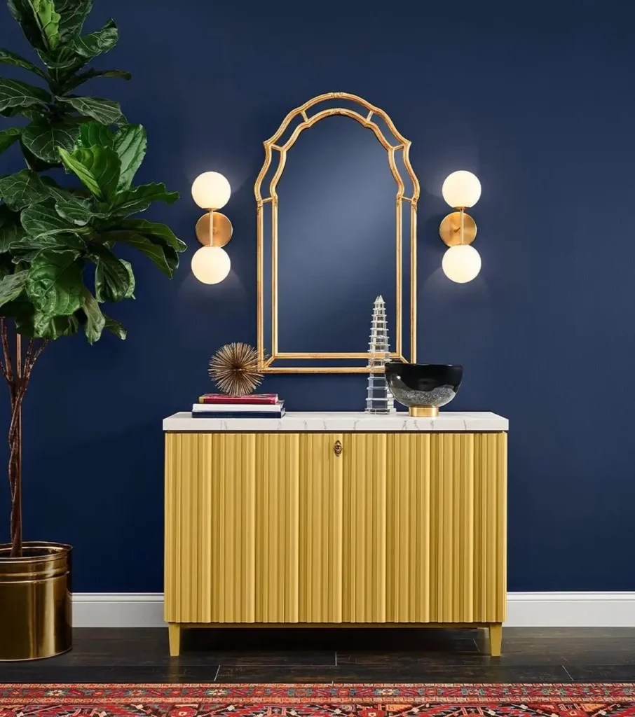
Image Credit: sherwin williams
Why it works in entryways: Naval has that “wow” factor. It instantly elevates the space and pairs beautifully with both traditional and modern décor. It’s also one of those versatile navies that works in almost any home style—whether you’re in a sleek city apartment or a historic house with character.
Tips for using it:
- Pair with warm metallics like gold, bronze, or brass for contrast.
- Add white trim or wainscoting to brighten the space and create balance.
- Looks stunning with patterned rugs in rich jewel tones—think ruby red or emerald green—for a layered, eclectic vibe.
- Consider a satin finish; it brings out the richness of the navy while staying durable for high-traffic entryways.
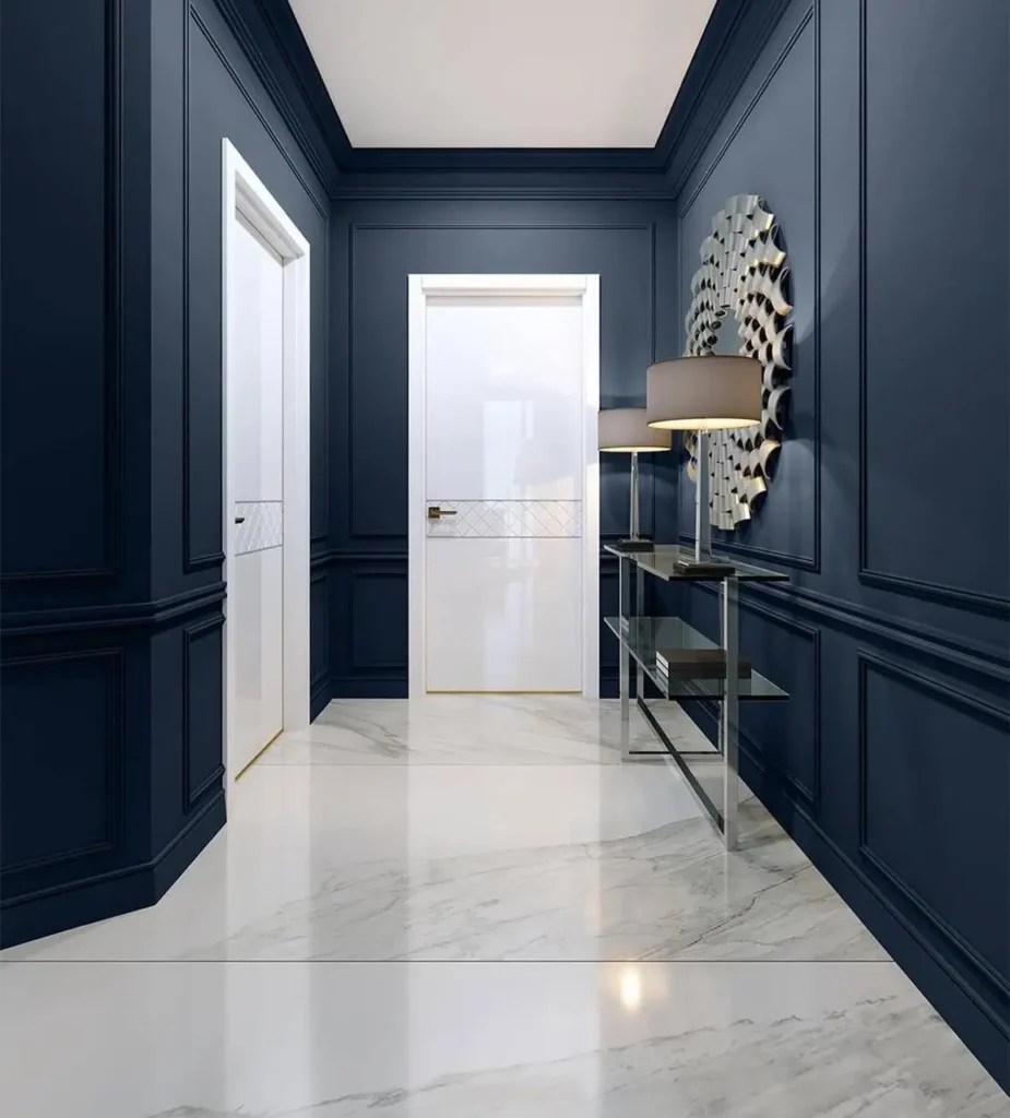
Image Credit: sherwin williams
5. Basque Green – Sherwin Williams
Looking for something earthy but still dramatic? Basque Green by Sherwin Williams is a deep, forest-inspired green that feels timeless and full of character. It’s moody and rich but has a grounding quality that makes it incredibly livable. This is the shade for you if you’re drawn to heritage colors with a historic vibe.
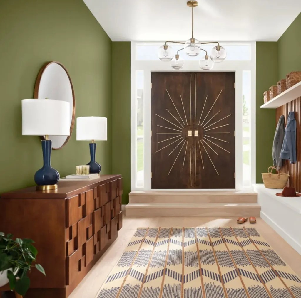
Image Credit: sherwin williams
Why it works in entryways: Green is naturally calming, and Basque Green brings that quality into your foyer while still making a bold design statement. It has depth and richness without being too flashy, which makes it perfect for creating a warm, welcoming entryway that feels connected to nature.
Tips for using it:
- Pair with antique wood furniture (like a dark oak bench or console) to highlight the historic character.
- Works beautifully with patterned wallpaper accents—try it above wainscoting or as a backdrop for a gallery wall.
- If your entryway opens into a living room or dining room, this shade transitions smoothly into warmer neutrals or lighter greens.
- For lighting, brass or copper fixtures will enhance the warmth of the green.
This is a color that feels timeless yet fresh – making it a fantastic choice if you want your entryway to feel both dramatic and grounded.
6. Black Bean Soup – Benjamin Moore
If you’ve ever wanted a dark paint color that’s dramatic without defaulting to black, Black Bean Soup by Benjamin Moore is a gem. It’s a rich, chocolatey brown with just enough depth to almost read as black in certain lighting. The difference? It has warmth, which gives it a more approachable, grounded feel.
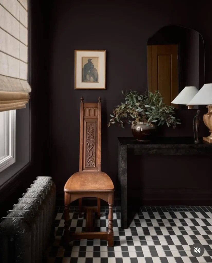
Image Credit: blancmarine
Why it works in entryways: Entryways take a lot of wear and tear, and this deep shade is both forgiving and elegant. It’s a fantastic backdrop for warm wood tones, leather accents, and earthy décor. Instead of feeling stark, Black Bean Soup creates a cozy, enveloping vibe right when you step inside.
Tips for using it:
- Use a satin or semi-gloss finish for durability—especially if kids, pets, or heavy traffic are in the mix.
- Pair with natural textures like a jute rug, woven baskets, or a reclaimed wood bench.
- Add lighter accents (white trim, cream upholstery, or pale artwork) to prevent the space from feeling too heavy.
- Warm metallics like antique brass or copper bring out the richness of the brown.
7. Gale Force – Sherwin Williams
For those who love colors that shift with the light, Gale Force by Sherwin Williams is a moody blue with gray undertones that feels sophisticated and dynamic. In bright daylight, the blue comes forward; in evening light, the gray dominates, giving it a smoky, mysterious quality.
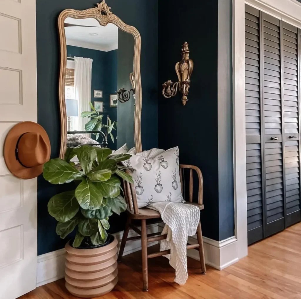
Image Credit: @ourgreencroft via: sherwin williams
Why it works in entryways: This is a shade that adapts beautifully, which makes it ideal for foyers that see changing light throughout the day. It can read traditional when paired with wood furniture or modern when styled with sleek black accents. It’s a versatile, chameleon-like color that keeps things interesting.
Tips for using it:
- Pair with matte black hardware or lighting for a sleek, modern edge.
- Add a statement mirror to reflect light and keep the space from feeling too dark.
- Works beautifully with stone floors or tile, as the gray undertones echo natural textures.
- Consider using it on built-ins or doors as well as walls for a bold, cohesive look.
8. Stiffkey Blue – Farrow & Ball
If you want a navy that feels inky and dramatic but still cozy, Stiffkey Blue by Farrow & Ball is a design darling. Named after the Norfolk beach where the mud reflects a similar tone, this shade has an almost lived-in warmth that makes it feel less formal than a crisp navy.
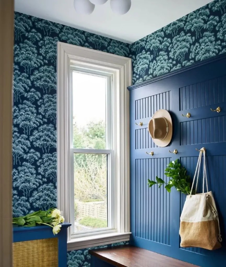
Image Credit: sarahcoleinteriors 📷 aredkuzia.
Why it works in entryways: Stiffkey Blue is moody without being cold. It adds depth and drama to foyers but still feels inviting, especially when paired with warm lighting and natural textures. It’s the kind of color that makes a space feel instantly designed—like you’ve thought about every detail, even if you kept things simple.
Tips for using it:
- Contrast it with warm white trim to highlight the richness of the blue.
- Layer with textural elements like a woven rug, linen cushions, or a rustic bench.
- This color shines when styled with warm metallics—think aged brass light fixtures or copper planters.
- For extra drama, consider painting doors and trim in the same color to create a seamless, cocooning feel.
9. Nocturnal Gray – Benjamin Moore
If you love the sophistication of gray but want something deeper and moodier, Nocturnal Gray by Benjamin Moore might be your match. It’s a rich charcoal with subtle blue undertones, which keeps it from feeling flat. Instead, it has depth and complexity that changes with the light—sometimes reading as slate, other times nearly black.
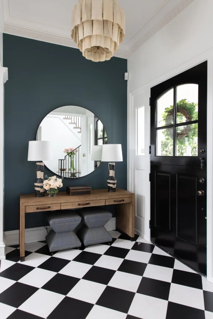
Image Credit: blackbanddesign
Why it works in entryways: Gray is timeless, but this darker take feels especially fresh in foyers. It adds modern drama without going as stark as black, and it creates the perfect canvas for statement lighting or bold artwork. If your entryway leans contemporary or minimalist, this shade brings a sleek, polished finish.
Tips for using it:
- Layer with warm wood furniture or woven textures to soften the cool undertones.
- Add plenty of lighting—wall sconces, a chandelier, or even a mirror to bounce light—so the space doesn’t feel too heavy.
- Pair with crisp white or pale gray trim for contrast, or keep trim the same color for a moody, modern vibe.
- Black hardware blends seamlessly with this shade, while brass adds warmth and contrast.
10. Windmill Lane – Little Greene Paint Company
For a bold yet elegant statement, Windmill Lane by Little Greene Paint Company is a stunning deep green-blue. It has a historic feel, rich and dramatic, yet still versatile enough to work in both traditional and modern homes. It’s the kind of color that feels layered and expensive, instantly elevating an entryway.
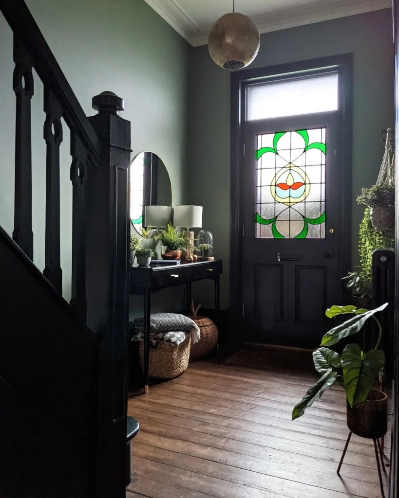
Image Credit: nospacelikehome
Why it works in entryways: This shade is ideal if you want your foyer to feel like a design destination. It has a heritage vibe that looks incredible in older homes with character details but feels equally at home in a sleek modern space when styled with the right accents. Its depth makes it striking, but the blue undertones keep it lively and welcoming.
Tips for using it:
- Pairs beautifully with patterned tile floors or a bold stair runner—it’s a great backdrop for statement flooring.
- Style with brass or copper fixtures to highlight its richness.
- Works especially well with warm, creamy neutrals in adjoining rooms for a smooth transition.
- Add natural greenery or plants—this shade enhances the organic feel of foliage.
11. Stone Blue – Farrow & Ball
Not every dark shade has to feel heavy. Stone Blue by Farrow & Ball is a bold, lively blue that still carries a moody undertone. It’s strong, cheerful, and historic in character, with just enough saturation to make a statement without overwhelming the space.
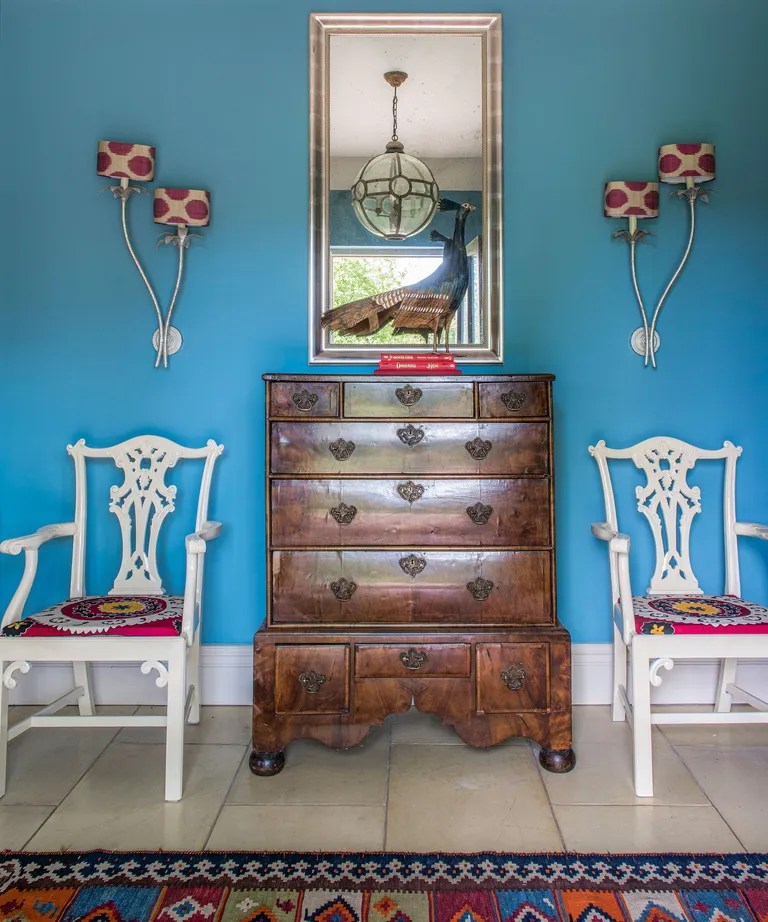
Image Credit: Jody Stewart via: homesandgardens
Why it works in entryways: Sometimes entryways benefit from a touch of energy, and Stone Blue delivers. It’s bold enough to be dramatic, but its undertones make it versatile—it can read modern, classic, or eclectic depending on your décor. For smaller foyers, it adds personality without making the space feel closed in.
Tips for using it:
- Pairs well with natural textures like jute rugs, raw oak, or linen upholstery.
- Try it with muted whites or warm grays for balance in surrounding rooms.
- Add a statement light fixture—the color reflects light beautifully.
- This shade also pairs nicely with earthy tones like terracotta or olive if you love layered, colorful interiors.
12. Smouldering Red – Benjamin Moore
For those ready to make a bold, unforgettable statement, Smouldering Red by Benjamin Moore is the ultimate moody entryway shade. It’s a deep, dramatic red with luxurious undertones—rich enough to feel daring, but warm enough to feel inviting.

Image Credit: Benjamin Moore
Why it works in entryways: Red is traditionally considered a welcoming color (especially in feng shui entryways, where it symbolizes good fortune and positive energy). In a deep, smouldering tone, it feels both modern and timeless. It’s bold, unapologetic, and instantly memorable—the kind of color that makes people stop in their tracks.
Tips for using it:
- Pair with dark woods like mahogany or walnut for a layered, luxe effect.
- Works beautifully with warm lighting (think amber bulbs or brass sconces) to enhance its richness.
- Keep adjoining spaces more neutral so the entryway becomes the focal point.
- Style with black or antique gold hardware for a classic finish.
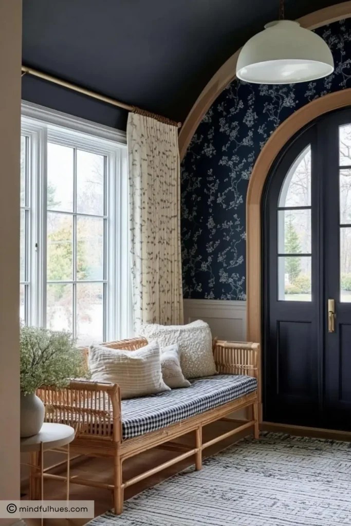
And there you have it—12 dark and moody paint colors that can completely change your entryway. From inky blues and dramatic greens to rich browns and even a smouldering red, these shades prove that bold choices can pay off in the most stunning way.
I hope this post gave you some fresh ideas and maybe even the nudge you needed to step outside the comfort zone of neutrals. Entryways are the perfect place to experiment—they’re small, transitional spaces that can handle drama without overwhelming your home. So why not venture into the world of deep, moody hues and let your foyer make that unforgettable first impression?
Leave a Reply